Transit-oriented development is often described with a simple phrase: “within 500 metres of a station.” It sounds clean. It is easy to map, easy to explain, and easy to compare across projects. But for serious station-area analysis, it is also too blunt.
A single 500-metre average can hide almost everything that matters: where development pressure is strongest, where land values actually move, where affordability pressure emerges, where construction disruption is concentrated, and where public policy obligations apply. The better question is not simply whether a property is “near transit.” The better question is: how close, during which phase of the transit project, under what zoning framework, and compared with which control area?
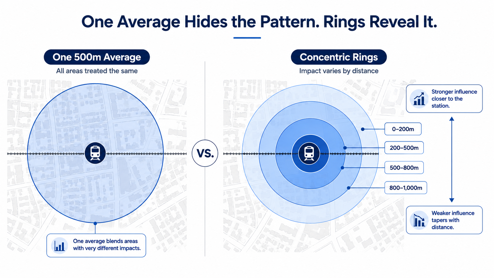
That is why station-area impact should be measured by rings, not averages.
The problem with the 500-metre average
A 500-metre station radius is useful as a summary boundary. It is not useful as the whole analysis. The area immediately beside a station is not the same as the area five or ten minutes away. The 0–200 metre band may face the highest density permissions, the strongest redevelopment pressure, land assembly activity, construction disruption, noise, access changes, and public-realm transition.
The 200–500 metre band may capture the strongest combination of walkability, livability, and development feasibility. This is often where improved transit access can translate into strong residential demand without the same level of immediate station-edge disruption. The 500–800 metre band may still benefit from improved accessibility, but its response can be more gradual and more dependent on local zoning, lot patterns, existing built form, and neighbourhood conditions.
When all of these areas are blended into one average, the result can look precise while hiding the actual pattern. A single number may say, for example, that values within 500 metres rose by a certain percentage. But that number does not show whether the uplift happened closest to the station, farther out, only in condos, only after opening, only after rezoning, or only in areas that were already appreciating before the project.
That distinction matters for governments, investors, lenders, and communities.
Distance is not just geography. It is policy.
Station-area rings are not only spatial categories. They are also policy categories. Around major transit stations, zoning permissions, density targets, inclusionary zoning rules, infrastructure capacity, and development economics often vary by distance from the station.
A credible station-area report should therefore separate the catchment into clear bands:
- 0–200 metres: immediate station influence
- 200–500 metres: core walkable station area
- 500–800 metres: outer transit-oriented catchment
- 800–1,000 metres: comparison or buffer zone
This structure makes the analysis more honest. It allows readers to see whether the transit effect fades with distance, peaks outside the immediate station edge, or varies by property type. It also helps prevent policy mistakes. If the entire 500-metre area is treated as one uniform market, governments may overestimate revenue, underestimate displacement risk, or miss where infrastructure pressure is actually concentrated.
 Time matters as much as distance
The second problem with simple station-area averages is timing. Transit projects do not affect real estate markets in one single moment. They affect markets through phases.
The announcement phase can change expectations before the service exists. Landowners, developers, investors, and residents may begin pricing in future accessibility early. The planning and rezoning phase can change development feasibility, especially if a site becomes viable for mid-rise, high-rise, mixed-use, or purpose-built rental development. The construction phase can create disruption through road closures, noise, access issues, lower foot traffic, and uncertainty. The opening and operation phase is different again: this is when the accessibility benefit becomes real for residents, renters, workers, visitors, and employers.
A strong station-area model should separate at least four stages:
- Announcement: future accessibility starts to affect expectations.
- Planning and rezoning: development feasibility changes.
- Construction: disruption and anticipation operate at the same time.
- Opening and operation: realized accessibility begins to affect demand, rents, values, and activity.
Combining all of this into one “transit effect” can produce a number that is technically calculated but practically hard to interpret.
 Property type matters too
A transit station does not affect every property in the same way. A small detached home near a station, a condominium tower, a purpose-built rental building, a retail plaza, and a mixed-use development site may all be inside the same 500-metre circle. But their exposure to transit-related change is not the same.
Condos may respond through sale prices, absorption, investor demand, and buyer preference. Purpose-built rentals may respond through rent growth, occupancy, tenant demand, and long-term income stability. Low-rise properties may respond through redevelopment potential, land assembly pressure, zoning optionality, and neighbourhood transition. Commercial properties may respond through foot traffic, customer access, business disruption, and future mixed-use potential.
For lenders, insurers, municipalities, and infrastructure agencies, these differences matter. A station-area average that does not separate property type can hide both risk and opportunity.
Why this matters for public revenue
The first article in this series argued that transit-oriented development is not only a housing strategy. It can also be a public revenue strategy. But that revenue argument only works if the geography is measured properly.
A city cannot understand tax-base expansion if new development is not separated by ring, property class, tenure, and timing. A province cannot understand education levy growth if new assessment is blended with general market appreciation. The federal government cannot understand rental-income exposure if gross rent is confused with taxable net rental income.
A condo project 150 metres from a station, a purpose-built rental building 450 metres away, and a low-rise property 750 metres away may all be “near transit.” But they do not have the same fiscal profile. The municipality may care about assessed value, property class, completion date, and whether new development is actually added to the tax base. The province may care about education levy growth from new assessment and broader economic activity. The federal government may care about net taxable rental income, construction-related activity, and income generated by new housing supply. The community may care about affordability, displacement, access to services, small-business continuity, and whether the benefits of transit are broadly shared.
One 500-metre average cannot support all of those questions.
What Gnowise adds
This is where Gnowise can provide a more useful station-area intelligence layer. Instead of reporting only one average around each station, Gnowise can structure the analysis by:
- Station
- Distance ring
- Property type
- Tenure
- Development phase
- Market cycle
- Assessment status
- Confidence level
- Public revenue channel
- Affordability and displacement indicators
This makes the output more useful for different audiences. For municipalities, it can show where new assessment and development intensity are emerging. For provincial stakeholders, it can show where station-area growth may expand the education levy base. For lenders and investors, it can show whether value uplift is broad-based or concentrated in specific rings and asset types. For community stakeholders, it can show whether accessibility gains are being accompanied by affordability pressure or displacement risk.
Most importantly, this approach prevents overclaiming. Gnowise does not need to say every station creates the same value uplift. The stronger argument is that each station has its own impact pattern — and that pattern should be measured properly.
The right model: rings, phases, and evidence labels
A serious station-area report should not present every result as equally certain. Some results are observed. For example, building permits, completed units, assessment records, transaction data, rent listings, and land-use changes can be measured directly. Some results are estimated. For example, a model may estimate whether a station area outperformed a comparable control area after an announcement, rezoning, construction milestone, or opening. Some results are scenarios. For example, future property-tax capture, education levy growth, rental-income exposure, or affordability pressure depends on assumptions and should be shown as a range.
A good station-area dashboard should label results clearly:
- Observed: directly measured from records.
- Estimated: modelled using a defined statistical method and comparison area.
- Scenario: projected under stated assumptions.
This distinction makes the analysis more credible because it tells readers what the evidence actually supports. It also helps governments and institutions use the information responsibly. A confirmed building permit is not the same as a forecasted redevelopment scenario. A measured rent trend is not the same as a projected affordability risk. A current assessment value is not the same as future tax-base expansion.
The more important the decision, the more important the evidence label becomes.
What not to do
The weakest approach is to publish a single headline such as:
“Properties within 500 metres of transit increased by X%.”
That may be fine for a promotional graphic. It is not enough for a policy, investment, lending, or public-finance decision. It does not show the distance gradient. It does not separate announcement from construction or opening. It does not separate condos from purpose-built rentals. It does not separate market appreciation from taxable assessment. It does not show whether the station area was already outperforming before the transit investment. It does not show whether revenue growth is public, private, realized, or only potential. It does not show who benefits and who may be displaced.
A better headline would be:
“Station-area impacts vary by ring, phase, property type, tenure, and market context — and the strongest policy insights appear when those layers are measured separately.”
That is less simplistic, but it is much more useful.
Why governments should care
Governments are being asked to make large infrastructure, housing, climate, and land-use decisions at the same time. They need to know where transit investment is creating measurable value. They need to know how much of that value is being converted into housing supply, public revenue, affordability, and local economic activity. They also need to know where value is created privately but not captured publicly.
That requires more than a radius on a map. It requires a station-by-station evidence system.
The 500-metre boundary can remain part of the conversation. But it should not be the conclusion. The future of transit-oriented development analysis is not one circle around a station. It is a layered model: rings, phases, property types, fiscal channels, affordability pressure, and community outcomes — measured together, but not blended into one misleading average.